My Sister asked me to do a logo for some T-Shirts for a benefit run in Boston for ALS (a.k.a. Lou Gehrig's Disease). For a good cause and an opportunity to gain some good karma. I, of course, accepted.
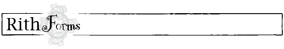
The team will be running on October 26th in Boston, MA under the name Dini's Defenders. Dini is my brother in laws sister, who has this unfortunate and painful disease. I won't go into details on the personal side of the subject. But, I would like to talk a bit about the logo itself, and ask you what you see in it. What is the message it sends to you?

I am happy with the result. I must admit that I did not hand draw all this in adobe illustrator. It was more of a source and massage operation. The ALS logo was lifted and traced from the ALS website. The bird was a piece of free vector clip art as were the poppey flowers. The Filligre is just a stock brush applied to a circle. But this is a perfect example of the whole being greater than the sum of its parts. Assembled as a crest the form has some weight. Dimension is created by layering the elements and extending them beyond the boundary of the crest. Positioning the bird was probably the most difficult part. The goal was to expose enough of the center of the A so that it remained recognizable, while still maintaining the flight path of the bird from the hand. The smallest movement seemed to disrupt everything. You may be thinking, it's just black and white, how boring. But, this is how I always start. The most primitive form of a logo will show you whether your foundation is solid. No amount of color or blending will salvage a poor arrangement.
When she first asked for a logo I had to ask what is my inspiration? What is her inspiration? What does she want to say? If she were an animal, what kind of animal would she be? After some back and forth we landed on birds and poppy flowers for the imagery. The bird is a great symbol. It represents spirituality, freedom, love, hope, purity, the list goes on and on. The poppy on the other hand has a checkered past. It's generally thought of as symbol of death. It can be associated with opium use, the westernization of China, and various other negative things. But, it also signals change, remembrance and honor for those who have passed on. The flower is quite beautiful, and their biology is such that they thrive in what many other plants would consider harsh conditions. I dont think its fair for the poppy to be the flower of death, and i dont see death in this logo at all. If I see anything in in this logo, I see hope. Freeing yourself from fear, viewing each obstacle as a challenge that will make you stronger, and letting yourself be free to fly and inspiring others to do the same.
Does everyone else see what I see? I can't say for sure, but I certainly hope so.